New Relic
Visit site
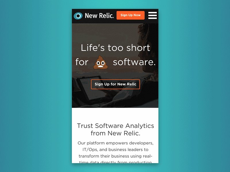
I was part of the team at DT that enhanced the site experience to scale with the New Relic’s trajectory. I designed site-wide living style guides, defined user task flows, created wireframes, prototypes, and mocks for many pages across the marketing site, as well as landing pages. We used conversion oriented tactics (such as A/B testing) to drive design strategy. The result of this project was New Relic’s successful IPO in December 2014 - they were valued at $1.5 billion by the end of their second day of trading.

Landing Pages – DevOps
In 2014, New Relic was on the cusp of exponential sales growth and product diversity. To capture as much of that growth as possible, we continuously experimented with landing page design in order to maximize lead capture and conversion. Below is an example of the design process of one such landing page, in this instance targeted at personas working in DevOps (developers, IT managers, etc.). The messaging of this page highlights the increased visibility and communication New Relic's products provide, which are crucial to the DevOps method.


The initial idea for the structure of the page was a step-by-step process that showed how an operations problem could be solved using New Relic’s software. After starting to wire a few ideas, we began to see that we could communicate the intended message much better if we constructed a narrative around a plausible real-world scenario in which co-workers used New Relic’s software in order to solve a problem.


In order to summarize the core of what New Relic’s software enables users to do, we ideated on a scenario that focused on a developer and IT operations manager using New Relic's software to identify an issue, figure out the root cause, and ultimately fix the problem. Since this was to be an ongoing conversation between two people, we began by sketching out some ideas for a timeline – this would communicate a conversation happening over an extended period of time.


Following our series of sketches, we found that it was time to mock up several ideas. Per client request, we started with an illustration in the hero section, which was quickly scrapped (we’d found through A/B testing other landing pages that big background photos worked best). We then moved our attention to the timeline element. After the first couple of iterations, we found that the timeline needed to feel more personal and direct – this would align it well with New Relic's general tone of being very straightforward and “nerd friendly.”

The final result is direct and personable, clearly communicating a conversation which demonstrates how New Relic’s software can be utilized in a real-world situation in order to quickly and effectively solve a potentially catastrophic problem. The page hits on all of the most successful landing page patterns which were proven (through A/B testing) to convert best: big background images, collapse forms into buttons, and minimizing the number of possible actions on page (to focus the user's attention).
Landing Pages – eBooks & Whitepapers
Through continuous A/B testing, we found that the most important thing to increasing conversions was keeping the landing page distraction free by minimizing the number of possible actions on page. We took steps like minimizing the number of CTAs, minimizing copy, and optimizing titles to increase sharing. All of these efforts consistently led to increased conversion rates.


Emphasis is on resource type (eBook), to help users understand what they're looking at. This led to confusion, because the title of the eBook got lost in the hierarchy.
Emphasis on eBook title. Copy appears visually reduced because of spacing, helping users to focus on taking action. Much more successful layout.


Also placed emphasis on resource type (Whitepaper), to see if the type of resource made a difference in user response to this layout. The result was the same, users preferred more emphasis being placed on the resource title rather than the resource type.
Emphasis on Whitepaper title. It was found that labelling the resource as a Whitepaper wasn’t necessary, because users were more interested in the subject matter. Black was used in an attempt to bring more attention to the form fields, but ended up distracting users from the CTA due to its visual weight.
Software Analytics Product Pages
In addition to designing landing pages, I worked on many of New Relic’s feature product pages on their marketing site. The goal of these pages was to showcase New Relic's marquee products in order to convert investors and product buyers (as opposed to product users). This was accomplished through the use of big, beautiful imagery (product shots and illustrations), compelling copy, social proof, and simple CTAs.


Application Performance Monitoring is one of New Relic’s marquee products, so we sought to create a product page that would do it justice. This was accomplished with bold and straightforward copy, product images, and easily scannable illustrations.
This product gives power users more advanced, granular analytics. In order to effectively target those types of users, we used a diagram to illustrate how various types of raw data can by used via the product. We also showcased different users personas and how they might use the product in order to do their jobs more effectively.


With mobile applications taking over the world, this mobile application product became increasingly popular, and therefore increasingly important. Device fragmentation, different carriers, and regulations around the globe all make it difficult to insure that a mobile application runs stably on a continuous basis. Understanding that, we highlighted the myriad of ways that users could understand the causes of app crashes (at a code level), as well as identify and prevent potential points down the line.
New Relic’s Browser product is intended to achieve much of what its Mobile product does, but for web apps. Because there are so many different languages and frameworks that can be used on the modern web, we chose to highlight common functions that are useful accross the board through relevant screenshots.

Synthetics is a relatively new product that allows users to test their app in a sealed environment. This way, they can iron out all of the kinks in their software prior to releasing it to the public. The ability to easily test how an app is doing anywhere in the world, at any moment is pretty amazing in itself. That’s why we chose to highlight it with a map that shows animated pings going off around the world.
Living Style Guide – Excerpt
I worked closely with our in-house development team as well as other designers to create and maintain a site-wide style guide. We found this to be of supreme importance as the size of the site ballooned along with New Relic’s growth. It was a challenge to implement, but well worth it in the long-run.

Mobile Navigation Interaction
New Relic’s desktop site utilizes a main-nav/sub-nav paradigm. We sought to simplify this in the mobile nav by essentially separating the main-nav and the sub-nav into two separate screens. This way, we minimized the amount of scrolling users needed to do, making it easy to move between levels in the menu system. While the implementation isn’t quite perfect yet, we think it’s in a great place so far.